ROLE : Product Designer (Contract)
SUPPORT : Lead Product Designer, PO, Engineering Team, BU’s, Stakeholders.
WEBSITE : EDUCATION FIRST
Education First
The EF Corporate Solutions app and website was going through a rebrand. Along with a revamp of it existing products to increase user engagement and retention, with a main focus on usability and cross device compatibility. The overarching goal was to bring consistency across the range of EF products across teams.
Approach
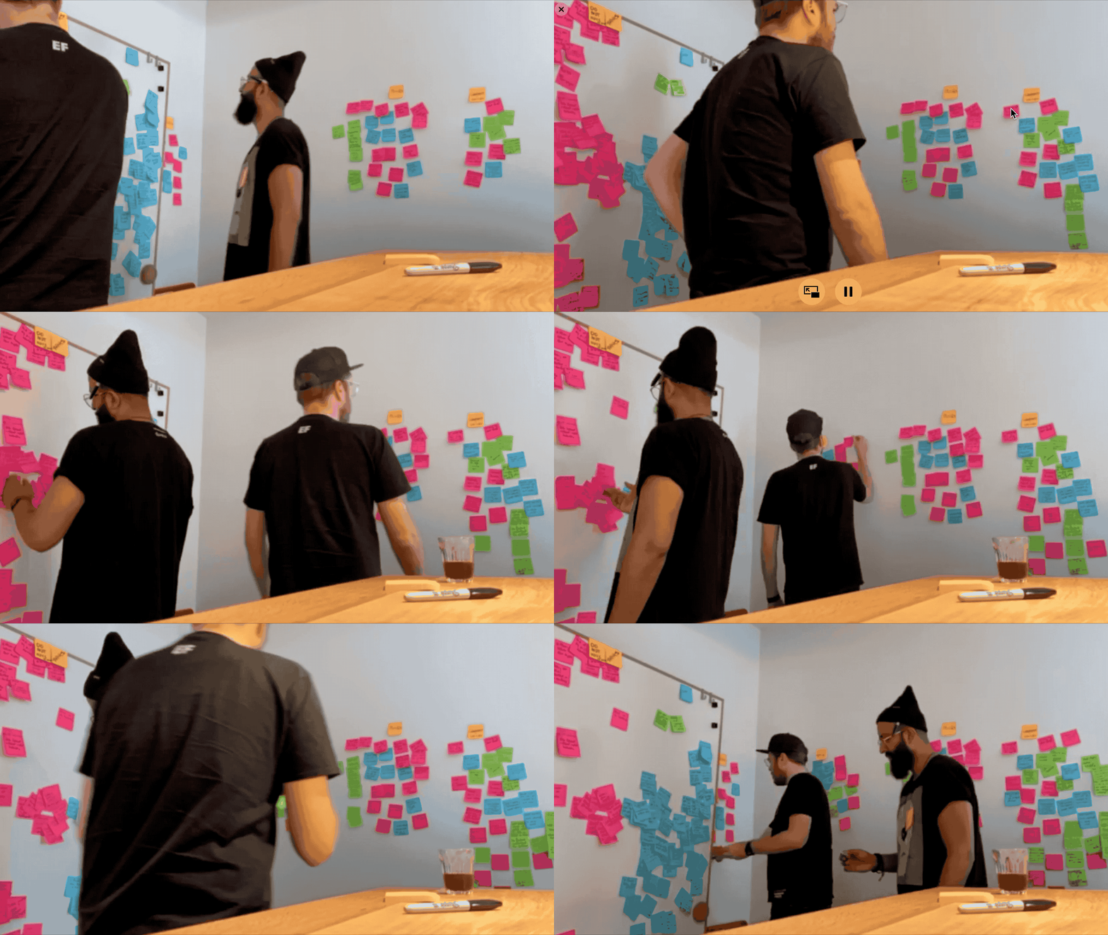
For the first part of the project we focused on the "Change Course” section. We began by carrying out competitor research and analysis. Which was followed an affinity mapping process to help us define the pain points.
To create our hypothesis, we conducted user interviews and ran brainstorming sessions to help generate ideas. We regularly set-up meetings with stakeholders to keep everyone on board and aligned with the projects progress.
AFFINITY MAPPING
Change Course Design Exploration
Pain Points
The current design had a number of UX and UI issues that needed to be addressed. One significant issue was that the system included the option for the user to change their course level at any point. This was potentially problematic because the user might select a higher level test for which they lacked the appropriate knowledge, resulting in that user failing the test.
Another issue we discovered was that the course descriptions were confusing and not well explained. Users often struggled to understand the difference between specialised and general courses.
The UI was inconsistent across the page and out of date with the new EF design system guidelines.
Level & Unit Lesson Structure
Change Course Pain Points
Layout & Exploration
I explored various different designs and layouts. The first design incorporated only minimal changes to the existing UI. For example, icons were added, which helped to create more space around the design whilst also encompassing key bits of data.
For the second design I focused more on a UI and UX revamp. I separated the different sections with clearer headings and new icons showing course times and skills learned. I also highlighted the selected states for prominency.
An evolution of version 2. For this new version, I focused more on the course information cards and how the user interacts with them. My design placed emphasis on the following user interactions: adding a new course, switching between courses, “selected”, “locked” and “done” states for each course.
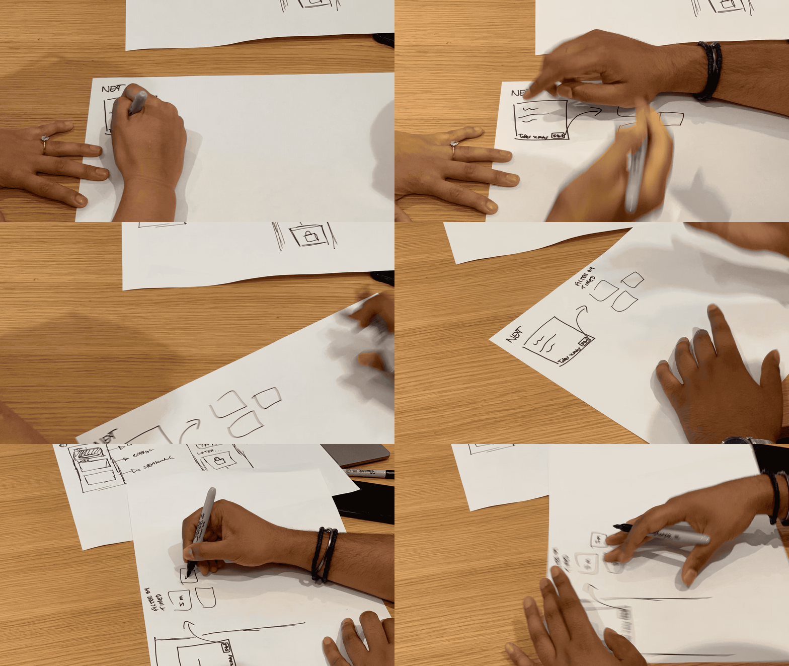
TEAM SKETCHING EXPLORATION
Exploration One
Exploration Two
Interaction Flow
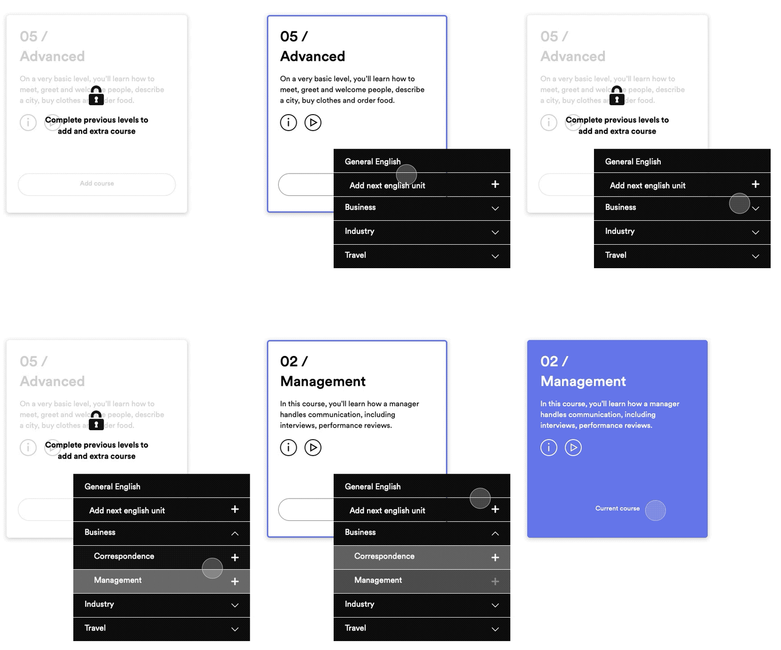
My main focus was on the course information cards and the user interactions surrounding them – in particular I focused on the selected, locked and done states for each of these.
Also explored varies different options of how the user might be able to switch between courses and also add a special interest course to their existing unit.
Card Design Exploration
Change Course Flow
Final Design
The final version of the design had a single row of cards which you can scroll through using the arrows. The sections were split between easy, intermediate, advanced etc.
There was also a “add card” state at the end of the carousel, with a focus on iconography for showing information on the cards about the course.
New Design Break Down
New Design
New Course Module
Prototype Testing
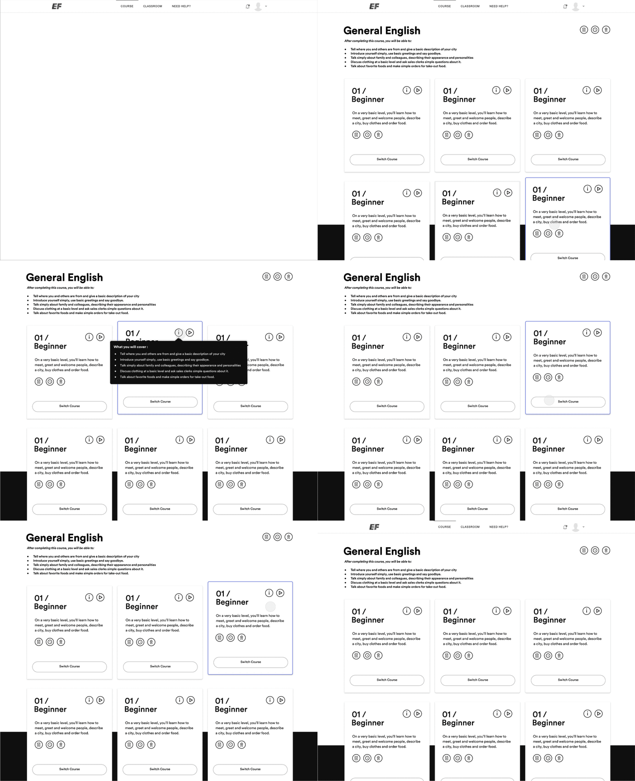
The most effective way we found to test the designs was to prototype them using Principle and then user test – via in-house guerrilla and cafe testing sessions.
This strategy also allowed for fine tuning of the more intricate interactions of the design
Change Unit Interaction
Page Interaction Exploration
Carousel Interaction Prototype
Mobile Dashboard
As part of the Change Course redesign I was also looking at the Enrolment flow for the app and how the “First Look”dashboard would work. This was early stages into the design process, having used the same process as the previous project we managed to user test some early prototypes of the app using Maze.
The good thing about this way was that we were able to test the prototype with a wide range of users and get detailed feedback over night.
Progress Snapshot Breakdown
Mobile Progress Snapshot
Closed Snapshot
Onboarding Screen


