ROLE : Product Designer
SUPPORT : Product Owner, Senior UX Researcher, Engineering Team
LINK : MOO.COM
Project Pixel
Research had shown that the ability to move and manipulate objects on the canvas is a basic expectation for users - which MOO does not support. Currently all of MOO’s competitors offer some sort of tool online which allows users to do this in some form or the other. In order to achieve this - Pixel needed an overhaul to support this functionality both from a technical and visual side - with an emphasis on a responsive web app.
Approach
Analysing existing research, user testing competitors and prototypes to highlight pain points and focus areas for design hypothesis.
Working with product to define MVP and iterations for alpha and beta.
Brainstorming sessions, ideation workshops, rapid prototyping. Output was used to refine and test hypothesis
Fully visualised wireframes and interactive prototypes were created along with in-browser design with engineers to test and learn.
Baseline studies were conducted looking at competitors ranging from web and native apps including Keynote, Pages, Canva and Vista Print.
“I wish the layout was more flexible. I went for a combination of text and image on one of the sides on my business card. I wish I was able to move the image slightly higher, but the layout doesn't allow that.”
— PIXEL USER
Pain Points
A lack of flexibility is our single biggest usability problem in Pixel today
It stops people from being able to make something they would be happy to buy
We’re falling further behind the competition
The bottom layout panel was often missed.
The concept of front and back was confusing - even more so with the option of Printfinity.
Front Side
Back Side
Wireframes
Quick round sketching sessions were done with the team to determine initial navigation and flow of how existing and new features would work on a smaller viewport.
Forced Context Exploration
The idea here was the user would always start on the “overview” which would allow them to see both sides ( front and back ) of the card. The user then would tap into each section to edit and tap out to go back.
Forced Context Flow
Mid-Fidelity Wireframes
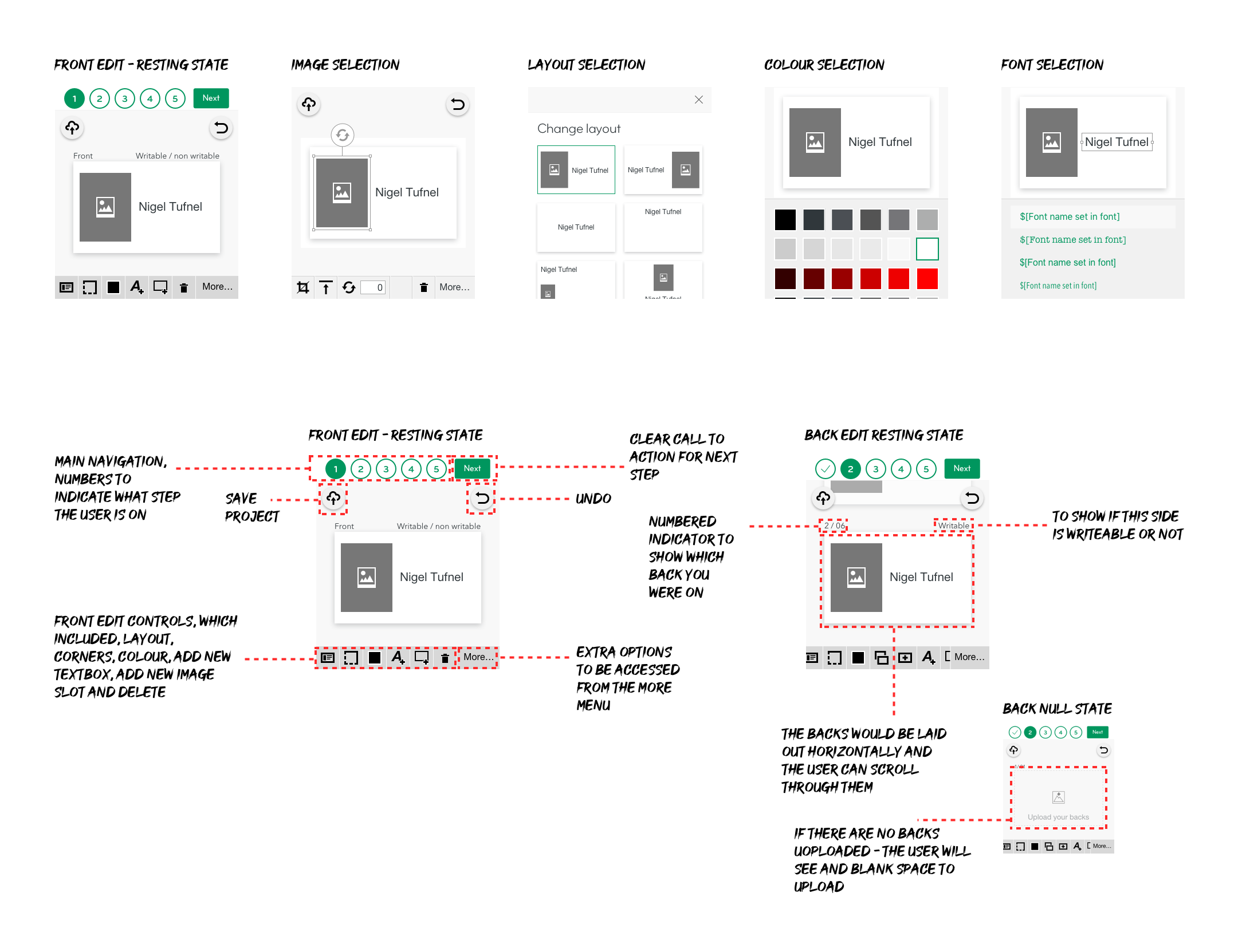
The force context navigation was fleshed out further - a mid fidelity set of wireframes were created for user testing - this also helped in exploring how the user would navigate through the back side of the cards.
Mid-Fidelity Wireframes


